ZoneStore - online store like Amazon. Description for front page elements - part 1

Looking for eCommerce ready to use website template for your business? Follow the most popular store tricks - Amazon. In this article, we describe the front page elements designed in ZoneStore online store website template for Joomla CMS inspired by Amazon.
Banners located at the very top of the website
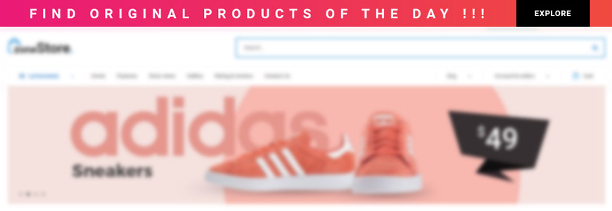
A small linkable banner located at the very top of the website allows you to increase the efficiency of sales and special offers and generate higher income by displaying a banner encouraging purchase. Pay attention to all visitors using the personalized message on the banner. It's easy and effective communication with site visitors.
It's a great place to highlight promotional codes and guarantee the success of promotional campaigns, sales, and time-limited offers. It is also an excellent means of communicating with users when introducing a new collection to the offer, announcing a special offer or during periods of increased traffic (Christmas, Black Friday, etc.). Thanks to this, no customer will miss the sale, which will translate into a more positive general shopping experience.
The visible place for your website logo
A website logo is an essential thing, and it is recommended to place it in the visible place for your visitors. Correct logo placement is a key and putting it in the top-left position is a common and proven practice. Make an impression on the visitors. They need to know which brand the store operates and remember it.
Visible search and an attractive list of results
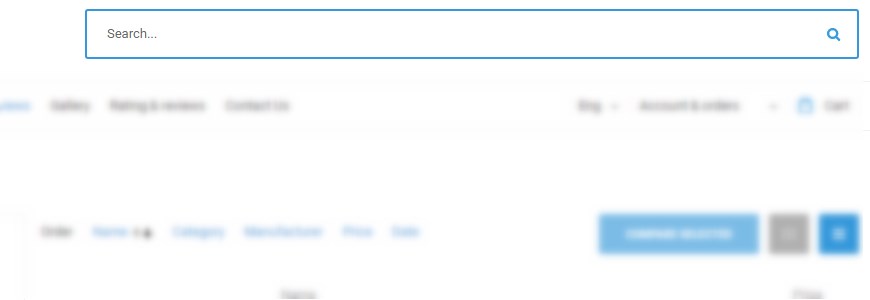
Search is some kind of a shortcut enabling people to quickly discover content without navigation. Your online store website’s users should be able to find the products that they are looking for but even more. But the attractive list of results can easily extend interest in similar products as well. The search box is placed like on the Amazon store in the top-right area of the page.
Well-organized categories
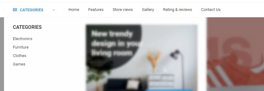
Including access to products categories on the front page is always a good idea. Why? Categories allow you to organize your store in a way that makes it easy for your customers to find what they're looking for. Remember to do not overwhelm customers with too many choices available. It’s always better to keep it simple and well-organized, especially when you sell many different products. Your products can belong to more than one category, so you do not have to exclude them anywhere if they suit well for various categories. Enabling the front page box with available categories can also be improved with an attached image, which increases the attractiveness.
The friendly account & orders & cart area
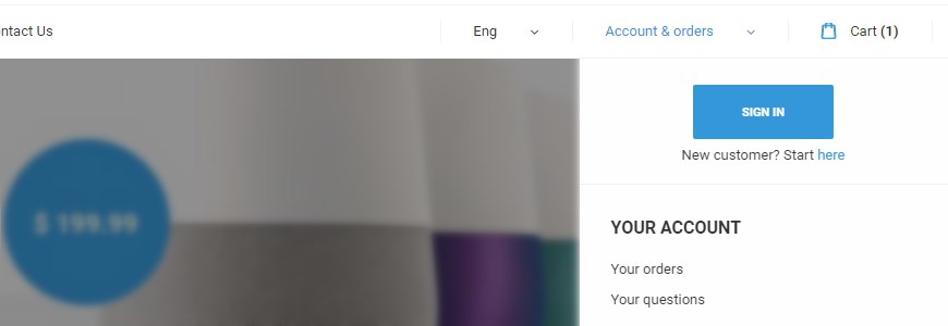
The user needs to have a quick possibility to register on your website and then the clear and quick access to the user area to his order details. Put the cart nearby to create all in one user area.
The slider is the significant element on the front page
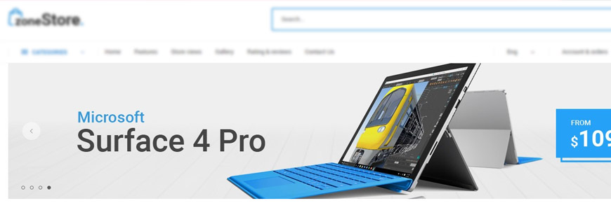
Your front page slider is the significant element, the very important element on your online store’s homepage. Users visiting your website will see the eye-catching slides and quickly understand what this store has to offer. It’s also a fantastic solution to draw your customers’ attention to your bestsellers and promotions.
Using slider, you can upload images of your best products and increase traffic. You can also YouTube and Vimeo videos to show product tutorials, promotional videos, and product reviews. Slides do not have only to slide because you can add call-to-action buttons, descriptions or include prices to convince your customers to click it. Remember that you have the full control over slides transition and it’s speed. The slider can be easily changed to a static image because it’s also a popular way of presenting content on the storefront page.
Show off most popular or new categories
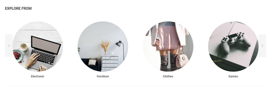
Show off most popular or new categories along with images of each category. If a website visitor is looking for, clothes (for example), he will quickly find a given group and can easily explore resources.
Show off your best selling products
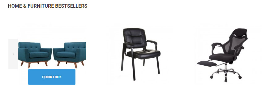
Make more sales showing off your best selling products! Take advantage of their popularity and display them on the front page. That is a popular technique to make customers see most often purchased items. Using images slider for this purpose allows users to make a quick overview. Each slide can include a link to a "quick look" button directing straight to the chosen item.
Promote your products using banners
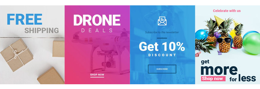
Promote your new products, hottest trends, special offers, discounts or giveaways professionally using banners. Banners are admittedly the very helpful part of the promotion in the modern online store. For sure they will help you redirect visitors attention to the specific element (for example those mentioned above) and trigger a banner click reaction. A banner can work magic when it comes to the online store, but they need to be eye-catching and include a right content.
A magnet for users looking for something special

Presentation of discounts and interesting offers is a perfect solution for the front page. The module presenting hot deals or products for a low price can be a magnet for users looking for something special. It is often the case that the new customer does not know what to focus on and the attractive looking graphics with short information can convince him to click.
The footer area should give the users quick access to the most requested information
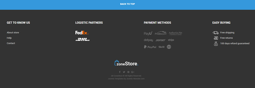
The footer area is a required standard feature of the online store website. It should give the users quick and easy access to the most requested information like Contact, Social media icons and widgets. It's also a great place to include elements such as links to Info about Store, Help section, Conditions of Use, Privacy Rules or about shipping, returns, etc. If you consider where to show off the logos of logistic partners or available payment method, the footer section is the right choice.
What's more?
- Catchy promotional ready-made page for ZoneStore eCommerce website design like Amazon - part 2
- Help & FAQ ready-made page for ZoneStore eCommerce website design like Amazon - part 3
- Optimal products list view for eCommerce website. Engage customers in browsing products - part 4
- eCommerce website accessibility for people with disabilities. WCAG compliance.
- Product description & order view - coming soon :)
Let us know your opinion!
Let us know what you think about ZoneStore eCommerce website template, do you like it?