Optimal products list view for eCommerce website. Engage customers in browsing products - part 4

ZoneStore ready to use eCommerce website template has been inspired by Amazon eCommerce design. ZoneStore is a much simpler eCommerce solution dedicated for small business online store owners, however, while building ZoneStore online store we were focused on details that play a great role and have a big impact on customers perception of products searching simplicity and ease.
Create an eCommerce website following the biggest brands selling tricks. If you are looking for best eCommerce solutions trust selling methods proven in practice like in Amazon store.
Earning the good website store reputation with products of good quality is a base, however, you also need to focus on eCommerce website design details. Amazon store gives us tips you may follow on your online store website.
Do not look around for eCommerce website builder all you may achieve with ZoneStore ready to use eCommerce website template to create a successful online store.
Template's demo versions
see examples for the front page
Useful, clear & easy to understand elements on products list
The more time a customer spends on your website the more your store is valuable for Google and it brings benefits for your Google ranking which reflects in your online store website visibility in Google search results. Once customers spend much time on the website it means that they found what they need and were caught by something, well-written content? layout arrangements? clearness? easy website navigating?
What is the goal? Make all customers read & browsing, browsing and read all day ;) OK, of course, it's a joke but it's important if you take care about eCommerce website elements significant for your customer depending on products you're selling.
What is the key? Display elements on product list (remember that this article is about product listings view ;) that are useful, easy to understand, clear & helpful to your customers. What's necessary and why? Let's take a look:
This is a single item on product listing view
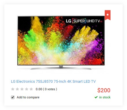
- Product picture - use high-quality pictures, if you are selling clothes use pictures with models, for toys use pictures with children playing, for the furniture show the room arrangement
- The product title including conclusive details - add several specific details for the standard product name to let your customers find the best searching match quickly, without the necessity of checking each product description and at the same time increasing the irritation
- Rating - nothing works better than other customers opinion, how many times you reply on somebodies opinion and buy something because other people recommend it? Display rating and commenting your products it's really helpful. Many times I found customers rating useful while purchasing clothes, for example, I appreciate when customers leave a comment regarding the cloth size and recommend buying a smaller or bigger size for my height.
- Price - do not hide prices forcing customers clicking on the full product description, it's very irritating. On the contrary display prices and use a red color that makes the feel of sale.
- Availability - imagine the scenario that you are looking for the product, get happy about your findings, go quickly to purchase it and then you discover that the product is out of stock. Displaying the short info about a product availability build the trust between seller and the customer. It looks professional, you as a seller inform your customers that the product is physically in your shop and you are ready to send it.
- Option to compare - give customers the possibility to make a deliberate decision, more about comparing find below.
- Featured product - to pay customers attention to specific products you may mark them as featured, customers wonder why it's featured and you may explain it in the product description
Do you set product filtering option correctly?
Whatever you sell, eCommerce feature like simple products filtering option is a significant value for customers - assuming that you correctly set it for your products. From the customer point of view, it's really annoying when you try to find a specific product and the store displays inadequate results, completely not according to checked filter options. That is why set filter options that really play a role for customers and are helpful while searching products.
From my point of view, I give the visited website chance twice and simply leave it if I get incorrect search results each time. The filter option is the important feature for customers who look for the exact specific product and usually are not interested in other ones. It's better to gently suggest related products using another solution rather than force customers to follow not wanted offers.
Simple products filtering
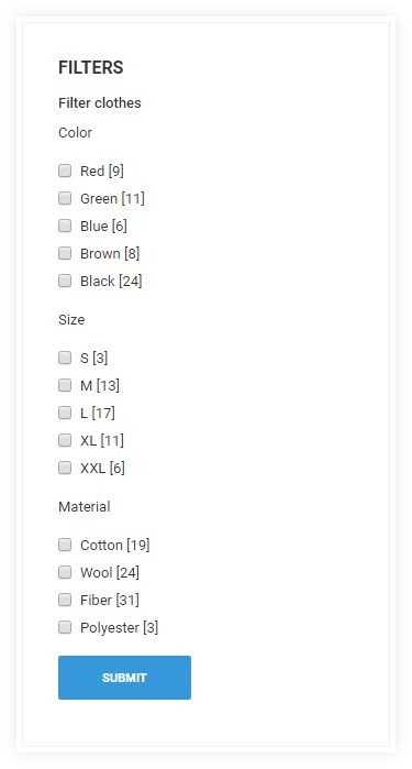
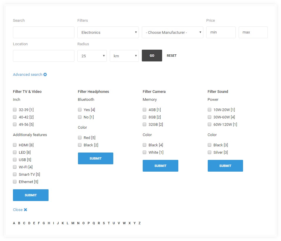
Optionally you may use the other boxed search and filter and alphabet filtering if needed. Each element of the searching area can be simply enabled or disabled at the eCommerce software backend. Depending on your needs you may adjust searching options to your store stuff.
Optional advanced searching and filtering solution
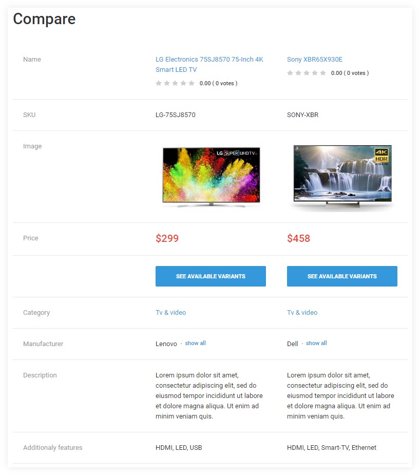
Compare eCommerce feature for lost customers
It's always the same scenario while I'm looking for electronic or products more complicated than clothes...Already browsed dozens of offers and I know nothing, I'm lost. Need to take a breath and think what's the required feature about the product I'm searching and compare all necessary and additional functionalities.
The same scenario follows many customers on your eCommerce website and the best solution to give them a hand is enabling comparing products option. This way it's more likely to happen that a customer makes a final decision and choose a product on your user-friendly store. In addition, once the customer compares products and decide to spend his money and finally chooses a product then his expectations are based on the info that the customer gathered in the comparison summary.
Products comparing
Catch customers who are in a hurry
Placing product ordering feature is so obvious, however, it's very often missed on online stores. I use this option quite often especially ordering by price, best rating and most popular products. If you sell many similar products in your store then the customer may not care about some specific details but want to choose products without any efforts. Ordering eCommerce feature may seem not so very important, however, thanks to this option you may catch customers who want to buy something quickly because searching too long is a waste of time for them.
For example, once I look for the sports t-shirt I really do not want to spend much time for searching the best specimen but simply filter using 100% cotton and filter by price or most popular t-shirt (among of dozens other offers) and then purchase the product quickly.
Products ordering

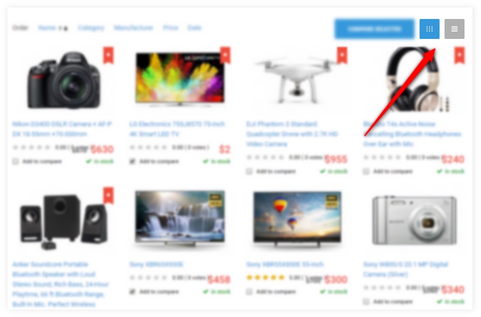
Table or Grid? What product listing layout you prefer while browsing products?
I like grid while browsing clothes but I prefer table while browsing electronic products. The product browsing preferences are not obvious, ask your friends and for sure you will get many different answers. Enable this simple layout switcher because it may occur very handy eCommerce feature for your customer. Let him feel even more comfortable on your store website and give the possibility to choose layout whatever you're selling!
Product listing layout switcher
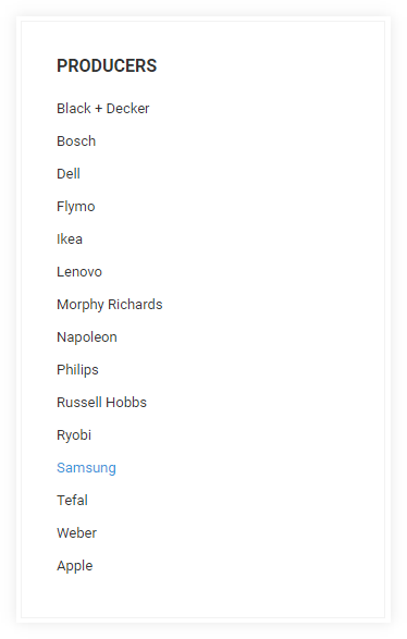
Customers often trust the quality brand
It's good to add the option to display products by producers because customers often are focused on the one or two brands and simply do not want to try other companies quality. That kind of customers trust just selected providers and do not want to spend any second reading other offers.
The producers' list
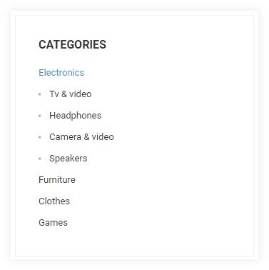
Displaying eCommerce category tree in a clear way
Displaying the product categories is the very basic eCommerce feature and I only want to show how it looks on the ZoneStore and mention about the possibility to display subcategories on the parent category view. It's optional and may look as on the screen below.
The clear design of the default eCommerce category menu
Subcategory view on the parent category
Optionally you may add a picture and a description to each subcategory

Want more?
- ZoneStore - online store like Amazon. Description for front page elements - part 1
- Catchy promotional ready-made page for ZoneStore eCommerce website design like Amazon - part 2
- Help & FAQ ready-made page for ZoneStore eCommerce website design like Amazon - part 3
- eCommerce website accessibility for people with disabilities. WCAG compliance.