How to create a simple website for a small company? Remember about must-have key elements to include!

If you run a business company and still do not have a website you should really consider building a simple and professional website of your company. You just can’t afford to not have a website of your business! The options on how you can benefit from having a functional website are endless. First of all, it is supposed to give customers all the info they need to know and the possibility to find you and your services. We will show you what to look for when building a simple business website and which elements are the key.
Eye-catching big photo at the front page
Using powerful pictures gives you an opportunity to make a real impact on website’s visitors. A popular way to create the stunning visual effect is to use an eye-catching big photo at the front page. Great images are an easy way to catch an attention. You can show products, your company employees or anything building trust and related to your business. The good example you may check on the company Joomla template demo sites for three different businesses
Template's demo versions
Simple menu ideas
The menu is an absolutely required for any type of website. A clever solution for a business website is to use a simple but eye-catching menu. As you can see in our example of a website for a lawyer, there is the vertical menu implemented on the left-hand side of the front page. Vertical menu is an efficient solution for a small company website giving short-named links and a direct access to the exact information that a visitor looking for.
If you use the standard horizontal menu remember to not overload it with many links and sub links. What is more important do not duplicate the same links under the same link name since your site visitor will be lost on your site, get tired of browsing your site and simply leave it and never come back :(
Clear way of presenting your company services
It is useful to have a separate part of a page to present your services and describe each of them. It’s also good when you present images with a short information. For example, tell your visitors what can do to help them. In this case, it is recommended to use encouraging pictures. As you can see in our example: the insurance company offers to find an agent, answer center, and a challenge.
- on the insurance company website you will find clear info about its offers referring to many insurance plans and additionally helps to find an agent, supports via answer center, and a get every challenge

- on the law office website, you'll find legal practice areas
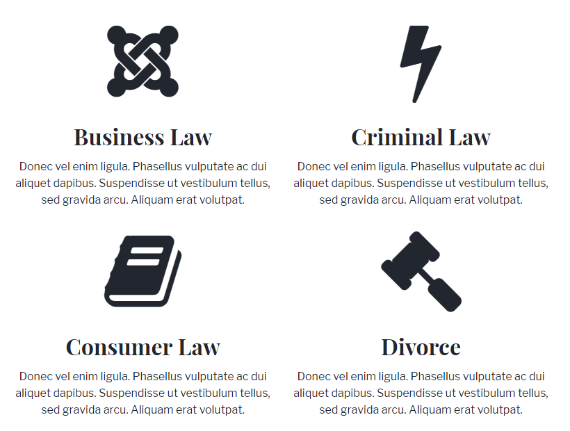
- on the advertising agency website what creative idea they serve
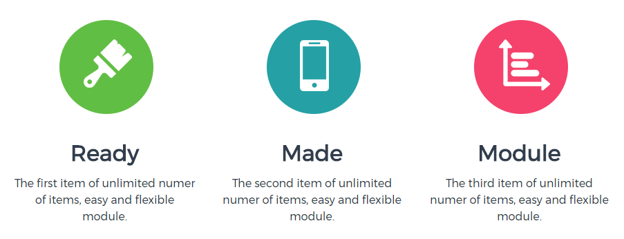
The more clean information you can provide about your services, the better. Want to achieve the similar effect on your Joomla template? Use additional features free Joomla module.
It’s the part of the content that converts - the clear and informative content has the huge ability to redirect audience to the action. Using your website as a tool is an excellent choice: it will serve your prospects and customers the information that they want in a moment. It will save your time and bring your visitors closer to the sale. Your main goal should be to convert visitors into customers.
Your experience is a value - give some tips for free
Depending on your business, you should have a few things on your website that can be called an information. Now let's look back at the example we used above. The insurance Joomla template presents important section "insurance must know info" - it is nothing more but things related to the business, these can be tips, interesting examples, stories or experiences. Remember - write for your audience! It’s so important making the website content search engine friendly by using specific keywords, links, and use SEO techniques. This does not mean that you have to give up on making your content readable and engaging for the people.
Quick contact and optionally a map
Contact information should appear on the homepage and make it highly visible is recommended. Showing contact information including a phone number, address, email address and social icons to business profiles adds legitimacy to your business. Don’t forget that your website’s visitors want to find the information quickly. Consider also showing a map with a location of your company. Customers need to be able to find a way to contact you or find your company in the area. The situation in which they are interested in your services but can not find you or contact you practically ends up your business.
Conclusion Conclusion
While there are a lot of important tips for an effective website building, including these key factors mentioned earlier can really make a difference. These often overlooked, or not taken into account elements can make the perception of your site completely different.