How to show or hide content by device?
When customizing your own Joomla 3 site for tablets and mobile devices, you may come to the conclusion that you do not want to show the whole content but hide/show some site contents on selected screens. In such a situation, help comes from the utility classes included to the Bootstrap library.
Responsive utility classes.
You will be able to show or hide content by device by using the following classes:
- visible-phone - visible for 767px screens and below
- visible-tablet - visible for 979px to 768pox screens
- visible-desktop - visible for 980px screens and up
- hidden-phone - hidden for 767px screens and below
- hidden-tablet - hidden for 979px to 768pox screens
- hidden-desktop - hidden for 980px screens and up
How to use?
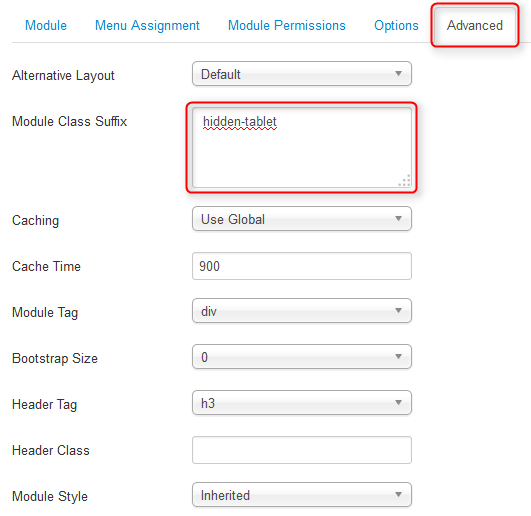
If you would like to hide/show a Joomla module for certain devices, simply add an utility class as module class suffix:

In some cases, when a Joomla module does not support suffixes or you would like to show/hide a template block, you can simply add an utility class as html class attribute:

Find more details on responsive features included to Bootstrap here.