
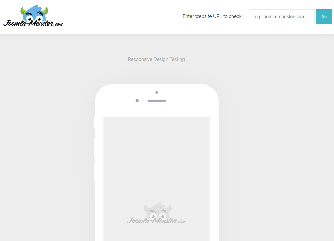
Some time ago we launched a new service for everyone who would like to check the website responsiveness - Responsive Website Test. No matter if you use CMS or what CMS you use you may test any website and check it is mobile friendly and its appearance on different mobile devices.
Why should you test how your site looks on mobile devices?
Nowadays using smartphones and tablets is built in at everyday life. In the last couple of years, the Web has drastically changed. Since first iPhone has appeared, a popularity of the mobile devices still grows and will be growing in future. Nobody can stop this :) Mobile devices like smartphones and tablets are just designed for consuming the Web. These days on many web pages we browse, even more, visitors from mobile devices than classic desktop computers.
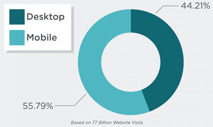
This shows us how important is to have a responsive website. Now, a responsive website is not an extra feature, no matter that you have a small blog, simple company site or large online shop, it's absolutely necessary to have a mobile friendly website. Because no one can afford to lose users.
Fewer users = fewer customers.
What is a responsive website?
Basically, the responsive website is only a short term for a website developed in 'Responsive web design' way. We can say that responsive web design is a set of techniques for developers which should make the website adjusted to the devices.
In other words, the page will respond to the devices if the user switches his laptop to iPad or different device, the website should also automatically switch to accommodate for resolution. But the new devices, with new screen resolutions, are being developed every day, how is it possible that one design may suit for all devices? It’s obvious that we can’t create custom solutions for each device. It's crucial that layout must adapt to the resolution. RWD is a concept which can improve the user experience.
How does the mobile friendly test work?
Of course, this service is not a real device it just imitates the mobile device but can be extremely helpful during page development. Basically, all is based on screen width.
Service emulates that the page opened on selected screen resolution. You can test website on most popular devices:
- iPhone 5, 6, 6s and 7
- iPhone 6 Plus and 6s Plus
- Samsung S6, S7, S7 Edge, LG G3, G4, G5
- iPad 1, 2, 3, 4, mini, Air and Air2
- Samsung Galaxy Tab 1, 2, 3
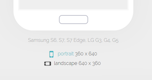
As you can see there is also a possibility to switch device orientation from portrait to landscape, because the same as in real life you can hold your smartphone in different ways which are related to available space.
Responsive website templates and extensions
We are proud that all of our Joomla templates and Joomla extensions uses responsive design techniques. Which means:
- layout grid (bootstrap) is flexible
- images are resizable
- template and extensions will adapt to the screen depends on a resolution
- easy customizable with CSS3 Media Queries
- modules can be visible or hidden depends on screen resolution
- well touchscreen support
IMG
Responsive web development techniques
If you are a developer here are some of the examples of techniques which can be used to make the site more mobile friendly.
Flexible Images
The most popular and simplest way is to add CSS style for the image:
img {
 max-width: 100%;
 height: auto;
}
This CSS styles make an image load in original (full) size as long as viewing area will be larger than image. If viewing area will be narrower, the image is scaled by the browser.
Media queries
This a technique introduced in CSS3. With @media rule we can add CSS styles only for selected resolutions.
@media screen and (min-width: 767px) {
 .col-1 {
 width: 50%;
 float: left;
 }
 .col-2 {
 width: 50%;
 float: right;
 }
}
In the example above, CSS will be applied for classes only for resolution greater than 767px. Of course, we can change min-width to max-width or even combine min-width and max-width.
@media screen and (min-width: 767px) and (max-width: 1200px) {
 .col-1 {
 width: 50%;
 float: left;
 }
 .col-2 {
 width: 50%;
 float: right;
 }
}
Show/hide content depends on resolution
Nothing prevents us from hiding some parts of the page and show others for the selected resolution with simply 'display' style:
.desktop {
 display: block;
}

.mobile {
 display: none;
}

@media screen and (max-width: 767px) {
 .desktop {
 display: none;
 }
 .mobile {
 display: block;
 }
}
Of course, these simple examples are not all you can do. There are plenty of helpful CSS and JavaScript techniques which help design responsive pages but the above ones will help you to understand the rules and go ahead for more.