Simple animated hover effect for images using CSS3 and HTML

In this article we woud like to introduce some of CSS3 styles that allows to display a code using animated effects. As for example we will take a product, which you can display in a custom HTML module of Joomla. Such a product you can link to an article, extension, or wherever you want. In our templates we often use CSS3 animated effects for VirtueMart products as well as for custom banners. Let's take a look at examples.
Example 1
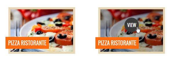
In the first example we present a product image and its title. On hover state the image will be darkened by semi-transparent black layer and from the top will appear the "View" button. Please see this example on live demo.
Please note this effect can be applied to any other image. If you have your own idea, then feel free to modify the code and CSS styles to fit your needs.
HTML code
Let's take a look at html code.
<div class="jm-item first">

	<div class="jm-item-wrapper">

		<div class="jm-item-image">

			<img src="http://yourdomain.com/images/image1.jpg" alt="Pizza Ristorante" />

			<span class="jm-item-overlay"> </span>

			<div class="jm-item-button"><a href="#">View</a></div>

		</div>

		<div class="jm-item-title">Pizza Ristorante</div>

	</div>

</div>
The markup is very simple. You need to create a container with the class „jm-item first”. Inside, you need to create another container with the class „jm-item-wrapper”. This container will hold a div with the class „jm-item-image” and a second div with the class „jm-item-title”. Inside the „jm-item-image” div, you need to put a product image, an empty span with the „jm-item-overlay” class and a div with the class”jm-item-button” which will hold a button link. Inside the „jm-item-title” you need to put a product title.
Let's look at the HTML code in detail.
If you would like to change an image to your own, you will have to edit a path for the img tag:
<img src="http://yourdomain.com/images/image1.jpg" alt="Pizza Ristorante" />
To change the button text and path, you have to edit this section:
<div class="jm-item-button"><a href="#">View</a></div>
The title can be easily replaced within this section:
<div class="jm-item-title">Pizza Ristorante</div>
CSS styles
Don't know how to get it? Order a custom service!
CSS styles of the main containers:
.jm-item {
    padding: 10px;
    display: inline-block;
    text-align: left;
}
.jm-item-wrapper {
	position: relative;
	padding: 7px;
	background: #E8D7B6;
}
CSS styles of the image and its container:
.jm-item-image {
	position: relative;
    overflow: hidden;
}
.jm-item-image img {
	display: block;
}
CSS styles of the title container:
.jm-item-title {
    position: absolute;
    left: -10px;
    bottom: 17px;
    background: #FF6B0E;
    line-height: 1.5em;
    font-weight: normal;
    padding: 7px 9px 6px;
    text-transform: uppercase;
    font-family: 'Oswald', sans-serif;
    color: #FFFFFF;
    font-size: 1.4em;
}
CSS styles of the span element:
.jm-item-overlay {
	background: #000;
	opacity: 0;
	position: absolute;
	width: 100%;
	height: 100%;
	top: 0;
	left: 0;
	-webkit-transition: opacity 0.5s ease-in 0s;
	-moz-transition: opacity 0.5s ease-in 0s;
	-o-transition: opacity 0.5s ease-in 0s;
	transition: opacity 0.5s ease-in 0s;
}
.jm-item-wrapper:hover .jm-item-overlay {
	opacity: 0.3;
}
CSS styles of the „View” button:
.jm-item-button {
	height: 50px;
	width: 50px;
	text-align: center;
	position: absolute;
	left: 50%;
	margin-left: -25px;
}
.jm-item-button a {
    border-radius: 50%;
    -webkit-border-radius: 50%;
    background: #FF6B0E;
    text-transform: uppercase;
    font-family: 'Oswald', sans-serif;
    color: #FFFFFF;
    font-size: 1.2em;
    line-height: 50px;
    -webkit-transition: all 0.2s ease-in 0s;
    -moz-transition: all 0.2s ease-in 0s;
    -o-transition: all 0.2s ease-in 0s;
    transition: all 0.2s ease-in 0s;
    text-decoration: none !important;
    display: block;
}
.jm-item-button a:hover {
	background: #3b3b3b;
}
The additional CSS styles for the „Example 1” are preceded by the „first” class used for the "jm-item" element. These styles are responsible for the animated effect of the „View” button.
.first .jm-item-button {
	-webkit-transition: all 0.5s ease-in 0.5s;
	-moz-transition: all 0.5s ease-in 0.5s;
	-o-transition: all 0.5s ease-in 0.5s;
	transition: all 0.5s ease-in 0.5s;
	top: -50px;
}
.first .jm-item-wrapper:hover .jm-item-button {
	top: 20%;
}
Example 2
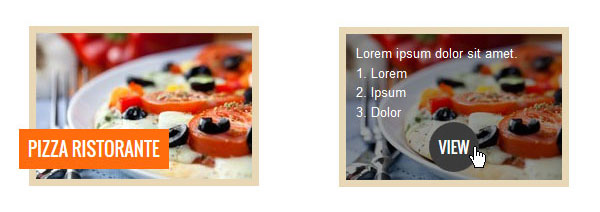
The second example is a little more complex comparing to the first one. On hover state, the image title will slide left and completely dissapear. From the bottom will appear the short description and the "View" button. Please see this example on live demo.
HTML code
Let's take a look at html code.
<div class="jm-item second">

	<div class="jm-item-wrapper">

		<div class="jm-item-image">

			<img src="http://yourdomain.com/images/image1.jpg" alt="Pizza Ristorante" />

			<div class="jm-item-description">

			    Lorem ipsum dolor sit amet.

			    1. Lorem

			    2. Ipsum

			    3. Dolor
			    <div class="jm-item-button"><a href="#">View</a></div>

			</div>

		</div>

		<div class="jm-item-title">Pizza Ristorante</div>

	</div>

</div>
You need to create a container with the class „jm-item second”. Inside, you need to create another container with the class „jm-item-wrapper”. This container will hold a div with the class „jm-item-image” and a second div with the class „jm-item-title”. Inside the „jm-item-image” div, you need to put a product image and another div with the „jm-item-description” class, where you need to put a product description and a div with the class”jm-item-button” for a button link.. Inside the „jm-item-title” you need to put a product title.
As you can see the html code is quite similar.
The image path and title you can change in the same section as for the first example.
However if you would like to change the product description and the "View" button text and its path, you will have to edit this section:
<div class="jm-item-description">

    Lorem ipsum dolor sit amet.

    1. Lorem

    2. Ipsum

    3. Dolor
    <div class="jm-item-button"><a href="#">View</a></div>

</div>
CSS styles
The basic CSS styles are the same as for the first example:
.jm-item {
	padding: 10px;
	display: inline-block;
	text-align: left;
}
.jm-item-wrapper {
	position: relative;
	padding: 7px;
	background: #E8D7B6;
}
.jm-item-image {
	position: relative;
	overflow: hidden;
}
.jm-item-image img {
	display: block;
}
.jm-item-title {
    position: absolute;
    left: -10px;
    bottom: 17px;
    background: #FF6B0E;
    line-height: 1.5em;
    font-weight: normal;
    padding: 7px 9px 6px;
    text-transform: uppercase;
    font-family: 'Oswald', sans-serif;
    color: #FFFFFF;
    font-size: 1.4em;
}
.jm-item-overlay {
	background: #000;
	opacity: 0;
	position: absolute;
	width: 100%;
	height: 100%;
	top: 0;
	left: 0;
	-webkit-transition: opacity 0.5s ease-in 0s;
	-moz-transition: opacity 0.5s ease-in 0s;
	-o-transition: opacity 0.5s ease-in 0s;
	transition: opacity 0.5s ease-in 0s;
}
.jm-item-wrapper:hover .jm-item-overlay {
	opacity: 0.3;
}
.jm-item-button {
	height: 50px;
	width: 50px;
	text-align: center;
	position: absolute;
	left: 50%;
	margin-left: -25px;
}
.jm-item-button a {
    border-radius: 50%;
    -webkit-border-radius: 50%;
    background: #FF6B0E;
    text-transform: uppercase;
    font-family: 'Oswald', sans-serif;
    color: #FFFFFF;
    font-size: 1.2em;
    line-height: 50px;
    -webkit-transition: all 0.2s ease-in 0s;
    -moz-transition: all 0.2s ease-in 0s;
    -o-transition: all 0.2s ease-in 0s;
    transition: all 0.2s ease-in 0s;
    text-decoration: none !important;
    display: block;
}
.jm-item-button a:hover {
	background: #3b3b3b;
}
The additional CSS styles for the "Example 2" are preceded by the "second" class used for the "jm-item" element. These styles are responsible for the animated effect of the product description and its title.
.second .jm-item-wrapper .jm-item-title {
	-webkit-transition: all 0.2s ease-in 0s;
	-moz-transition: all 0.2s ease-in 0s;
	-o-transition: all 0.2s ease-in 0s;
	transition: all 0.2s ease-in 0s;
}
.second .jm-item-wrapper:hover .jm-item-title {
	left: -100%;
}
.second .jm-item-description {
	position: absolute;
	width: 100%;
	height: 100%;
	padding: 10px;
	box-sizing: border-box;
	-moz-box-sizing: border-box;
	-webkit-box-sizing: border-box;
	background: rgba(0,0,0,0.4);
	color: #fff;
	top: 100%;
	-webkit-transition: all 0.5s ease-in 0s;
	-moz-transition: all 0.5s ease-in 0s;
	-o-transition: all 0.5s ease-in 0s;
	transition: all 0.5s ease-in 0s;
}
.second .jm-item-wrapper:hover .jm-item-description {
	top: 0;
}
Other Examples
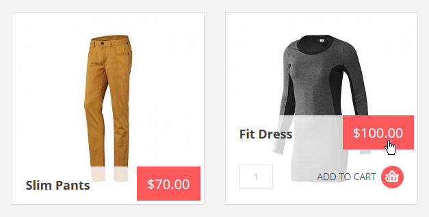
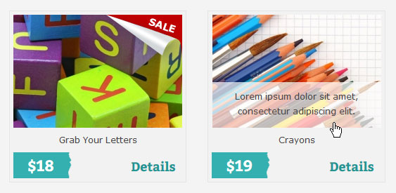
In our offer we have many templates that use animated effects. As for example, you can see JM-Modern-Store and JM-School-Tools-Store templates that include VirtueMart store component for Joomla. We have used similar CSS styles for products to present animated effects.
VirtueMart Products module in the JM-Modern-Store template:
VirtueMart Shopfront/Category views in the JM-School-Tools-Store template:
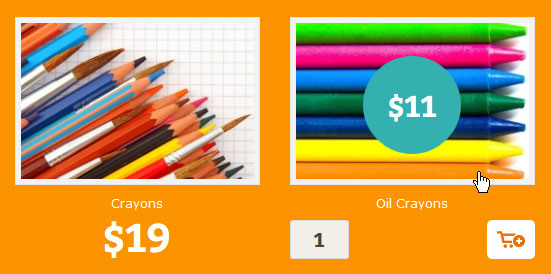
VirtueMart Products module in the JM-School-Tools-Store template:
Don't know how to get it? Order a custom service!
We hope that our examples will be useful for you as well as will inspire you to create your own, unique animated effects.